Tell those strokes where to go
A female design craft resurgence with two lettering lefties
Scope
Design Pedagogy and Publication Design
Team
Bec Nally, Creative Director
Jason Rohmursanto, Designer
Aprill Allen, Copywriter
Barbara Enright, Brush Lettering
Carla Hackett, Brush Lettering and Design
Mark Lobo, Zine Photography
Client
Lettering Lefties
—
2022-2023
It is rare these days to find such working relationships as this. Barbara, a woman who started learning her trade at age 14, knows lettering like the back of her left hand. Her knowledge is a life of lived experience — a woman in a male dominated industry, a small business owner, a left hander in a righty’s world. And Carla, a woman who fell in love with the craft during a time of lettering resurgence and found mentorship in Barbara.
Public Journal saw this project as an opportunity to share the story of two lettering lefties from different generations and help tell the story of their shared love and knowledge of Brush Lettering. With so much amazing content to work with, our role was to sequence the story and find ways to engage and inspire budding brushies through public pedagogy.
Central General Practice (CGP) Mansfield is a long-standing rural healthcare provider, woven into the fabric of the Mansfield community, on Taungurung Country, over 30 years. As Mansfield faces rapid growth and demographic shifts, CGP recognised the need to develop a visual identity that could honour its legacy while welcoming a new generation of patients and services.
CGP engaged Public Journal to lead a communication design approach that would reposition the practice as a trusted and future-ready health service, deeply embedded in place. The new brand identity needed to resonate with both long-time locals and new residents arriving from metropolitan areas, providing flexibility, clarity, and continuity across all touchpoints.
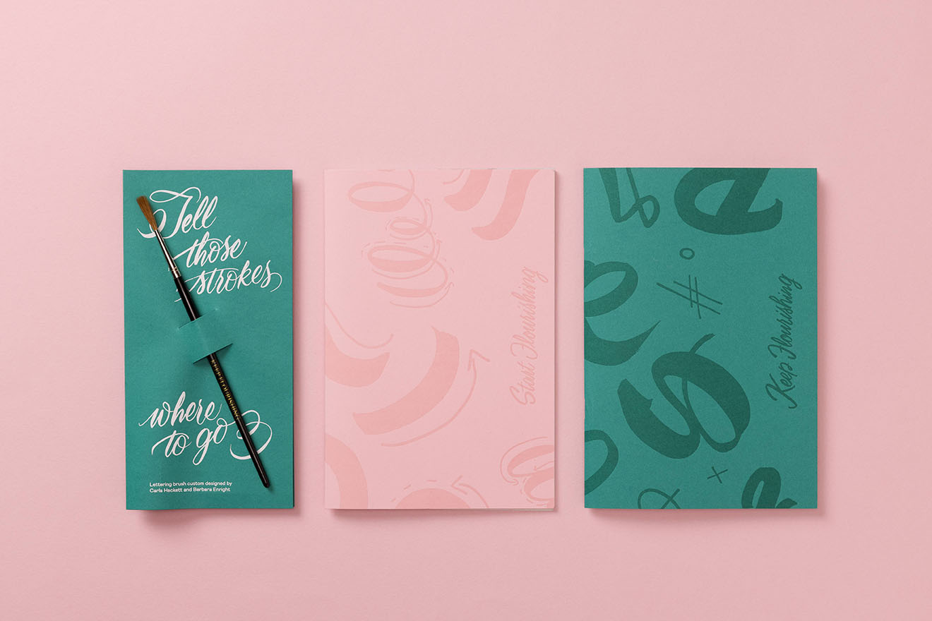
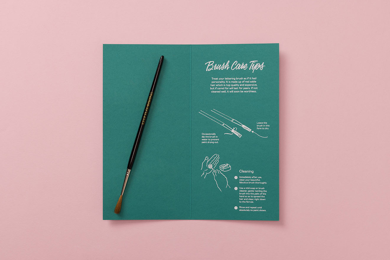
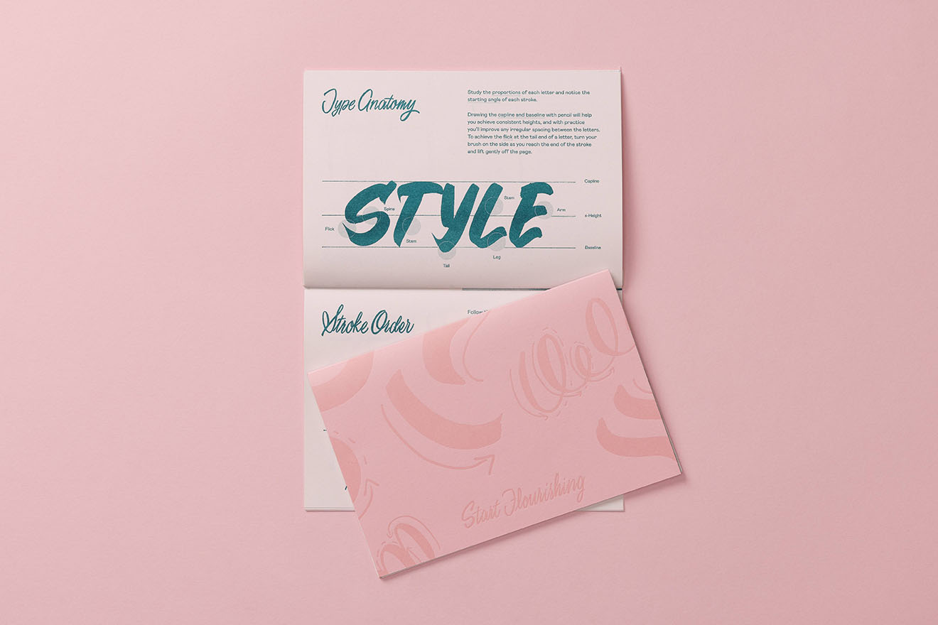
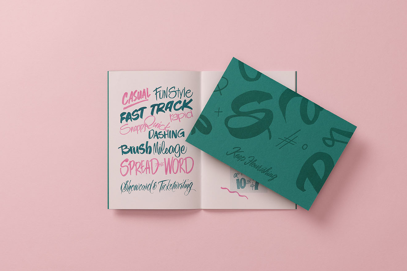
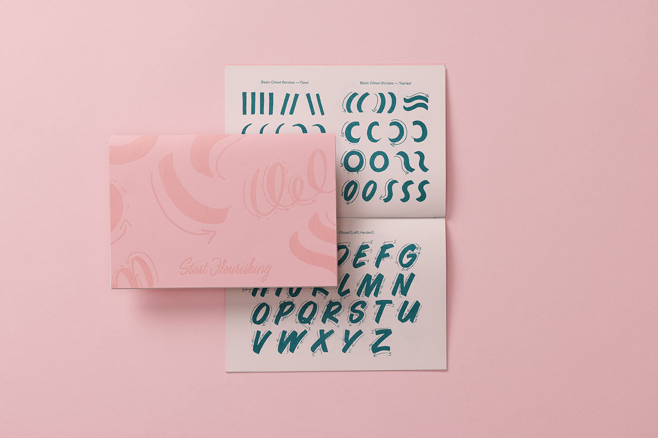
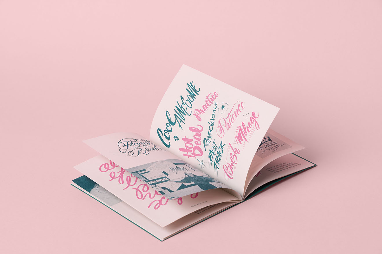
The publication is designed as three pieces — an Inspo Zine, Practice Zine and Brush Kit. Covers were letterpress printed in tonal ink and foil stamped on Candy Pink and Marrs Green Colorplan stock with Riso inners printed using bubblegum pink and teal rice oil based ink on Envirocare. All three pieces are banded together and housed in a custom envelope, each personalised with brush lettered names upon purchase.
Public Journal approached the work by listening to the CGP team and understanding the unique social dynamics of Mansfield. CGP's role in the community extends beyond clinical care — it is a relational hub, a place where trust is built over decades.
The last thing the practice needed was some flash design work from Melbourne—detatched from the real people living and working here. Finding an authentic voice became about listening and gathering threads.
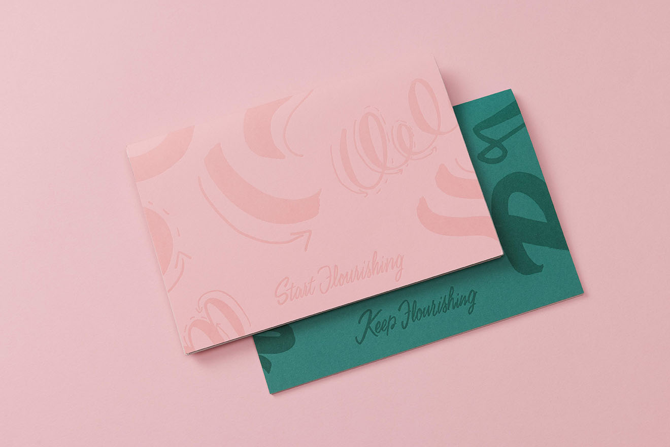
Start Flourishing and Keep Flourishing Limited Edition Zines
Letterpress covers were printed with the finest care, blind debossed to the perfect degree after much testing and tending by Hungry Workshop. The covers celebrate stroke order and styles with close-cropped edges that become image and pattern as much as letterform.
The design process was guided by conversations with CGP's leadership team, who brought sensitivity to the legacy of the practice while seeking a bold, adaptable future. Throughout, Public Journal remained committed to CGP's core values of Care, Culture, and Community, ensuring the visual identity would reflect the practice's dedication to compassionate, individualised care; a supportive and inclusive workplace; and an active contribution to community wellbeing.
Equally, the service design process focused on how the new clinic could best support the patient journey, the work of the clinical teams, and the daily rhythms of care. The new facilities were not simply an infrastructure upgrade—they were designed to better hold the growing demands on rural healthcare while continuing to feel local, known, and deeply attuned to the community.
CGP's distributed model supports a wide range of care—from general consultations and obstetrics to anaesthetics, skin procedures, wound care, vaccinations, travel medicine, pathology, and the Health Optimisation Program.
CGP’s service design prioritises flexibility, proximity, and relational care, ensuring that patients can access support where and when they need it. The new clinic further supports this by offering a calm, well-structured space that enhances the patient experience and makes it easier for clinical teams to work collaboratively.
The practice’s ability to meet people where they are—whether that is in a remote township, a school campus, a hospital ward, an aged care facility, or within the new central clinic—reflects a sustained commitment to community-centred health.
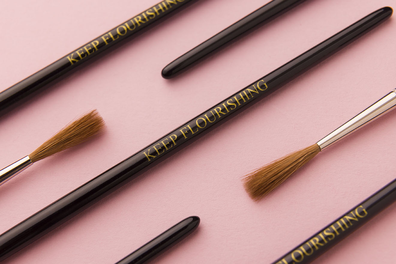
'Keep Flourishing' Brush
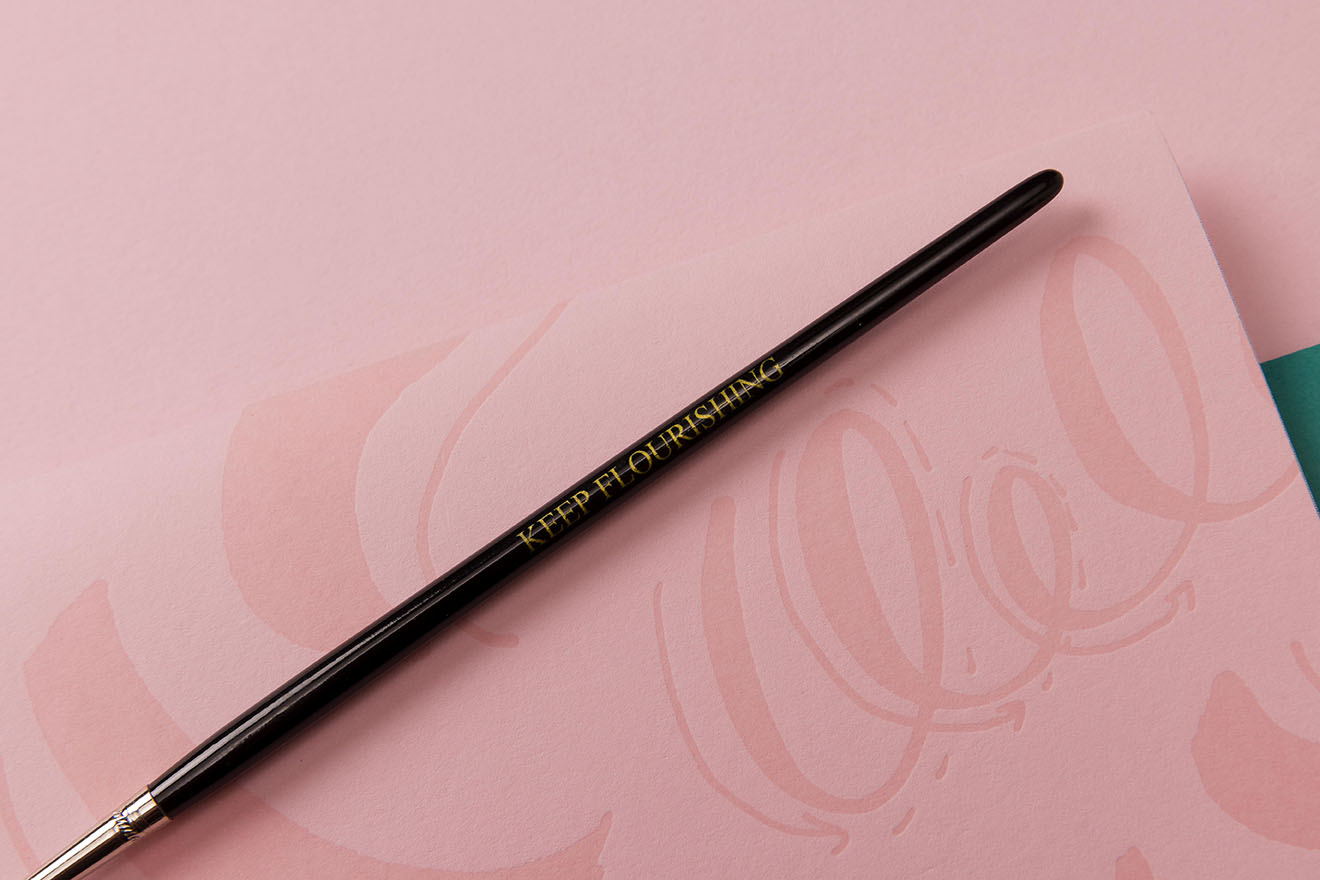
Letterpress Details by Hungry Workshop
Notepads and Envelopes
Used as core texts in brush lettering workshops and RMIT University Bachelor of Communication Design courses, the zines bridge intergenerational knowledge and have re-established brush lettering as a culturally relevant, embodied design practice. Their material and narrative contributions have been recognised in BLAG Magazine (2023), affirming their peer-reviewed significance.
Together, the zines and course provide a replicable model for embedding feminist methods into visual communication design.
The communication design is not a static solution but a responsive framework that can grow alongside CGP’s evolving services. The logo system allows CGP to flex between formal and informal settings, supporting both community recognition and internal shorthand.
The design accommodates CGP's umbrella approach to allied health, creating pathways for future brand extensions without diluting its core identity. By centring the story in place, the brand becomes more than an aesthetic update — it becomes a vessel for CGP's community-centred philosophy.
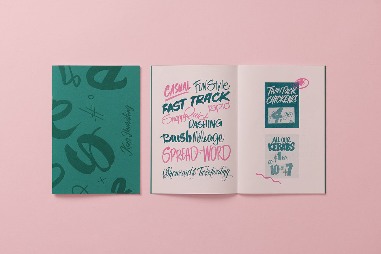
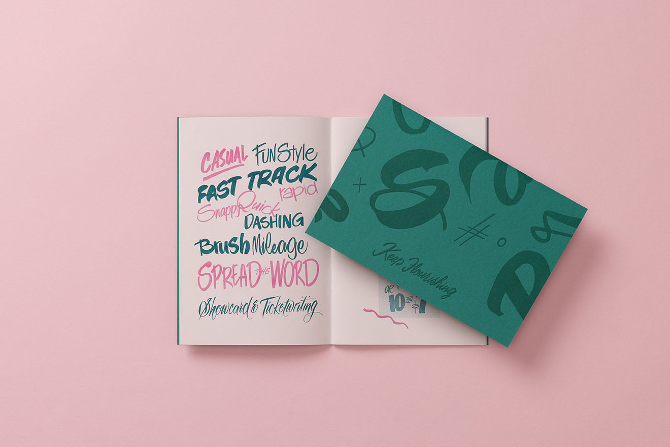
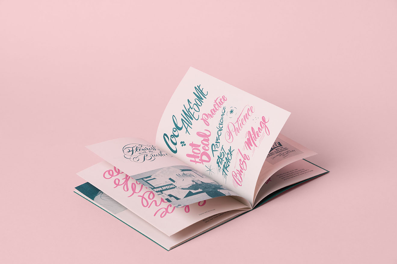
What a beautiful duo. Barbara and Carla's passion for Brush Lettering has brought this art form back to our design community with sparkle and joy.
The communication design actively strengthens CGP's position as a vocal advocate for locally governed healthcare, particularly important in a rural context where pressures to centralise services are growing. CGP’s new visual language offers quiet resistance to homogenised, corporate healthcare branding, instead amplifying the significance of place-based care.
